Glen Mills 55+ Community Common Space
A great place for friends to meet at Glenn Mills.
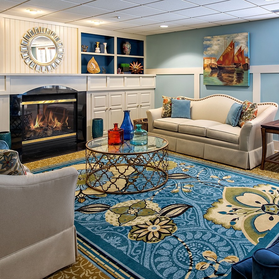
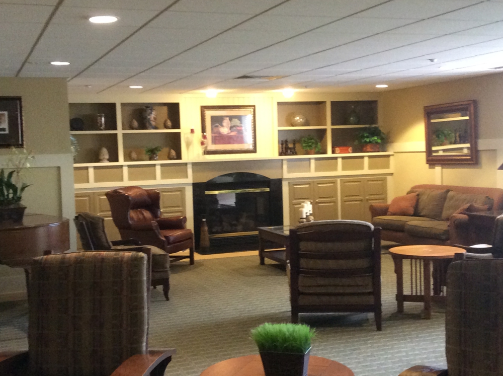
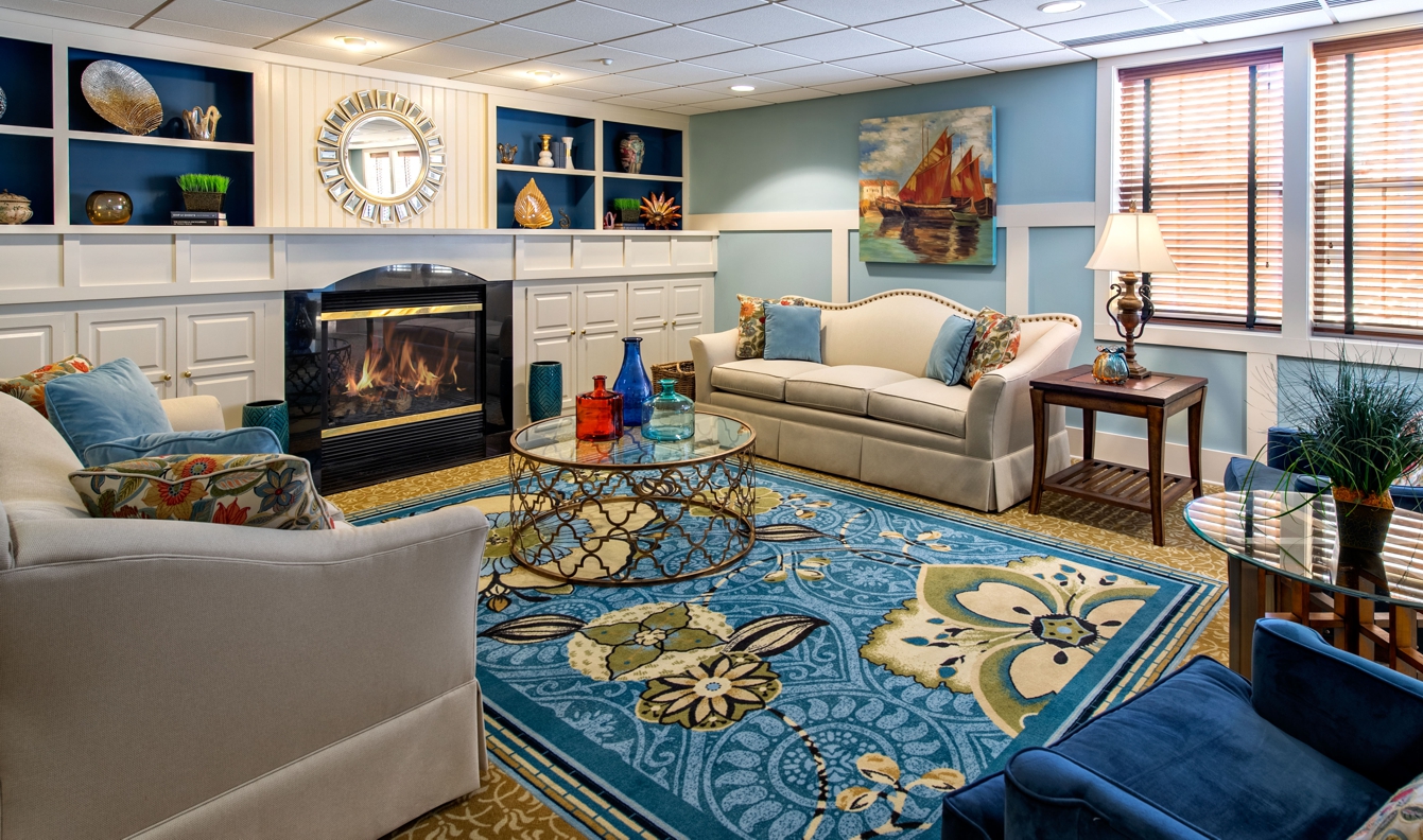
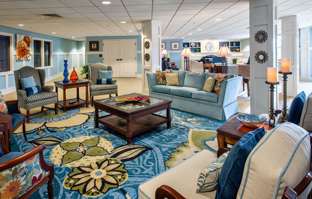
Kathy worked with the Board and the Design Committee. It was decided to avoid the golds, reds, and greens of the previous design that were very traditional. A color palette with a strong presence of blue was decided on to make the spaces feel fresh and updated.
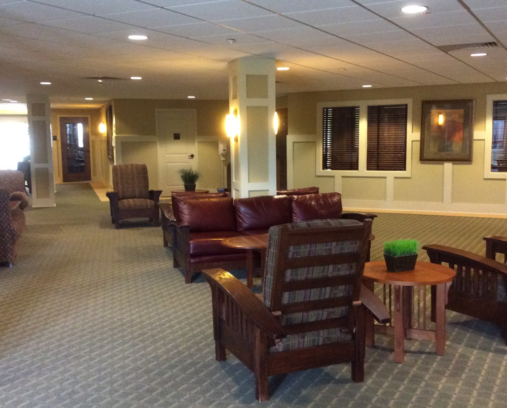
Starting with the owner’s hallways Kathy selected a patterned neutral tan carpet. She then introduced blue floral rugs in the seating areas to give them the wow that was requested. Due to the safety of the residents, the “rugs” are part of the wall-to-wall carpeting to avoid tripping accidents. This is how changes in design are handled in any hospitality situation.
The walls were painted a light blue, and in contrast the trim and built-ins in the main seating area were painted a bright white with the wall behind the shelving in a darker blue.
Much of the upholstery was re-upholstered with new wood furniture, artwork, and accessories mixed in with the existing. Old and new blended well together for a cohesive look.
Kathy planned the layout of this community common space in smaller conversation areas, conducive to multiple conversations.
With tact and patience, Kathy pleased the board and committee with her updated design and came in under budget!